Shopify App : Spacer: Add or Remove Space
Adjust the vertical spacing between sections & blocks
About Spacer: Add or Remove Space
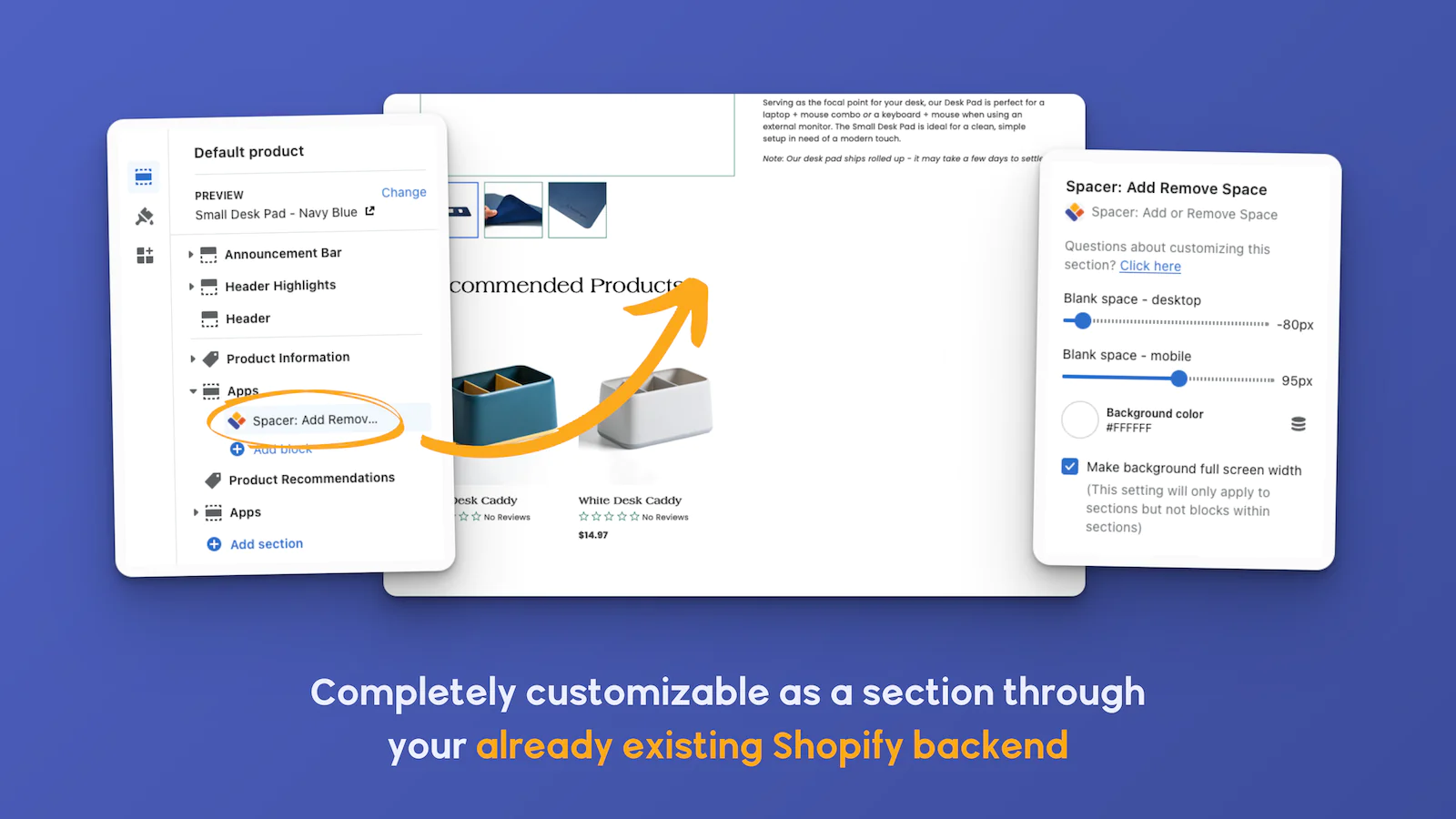
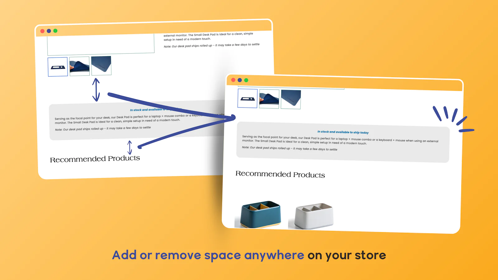
Add or Remove Blank Space : Insert up to 250px of blank space (or remove up to 100px of space) between any sections or blocks on any page of your website.
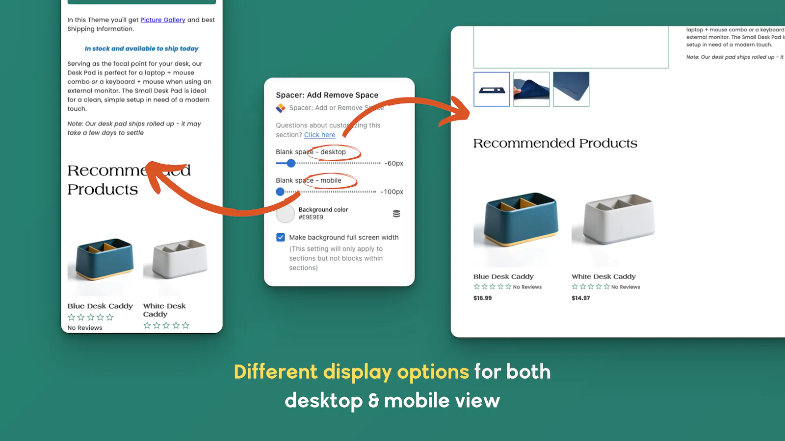
Desktop & Mobile Settings : For each 'Spacer' section/block you add, you can specify a different amount of vertical spacing for desktop and mobile devices.
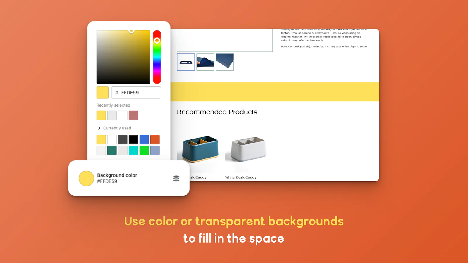
Add a Background Color : Add a background color to the spacer section/block to match the background color of the section/block immediately above or below it.
Are You As OCD As We Are?
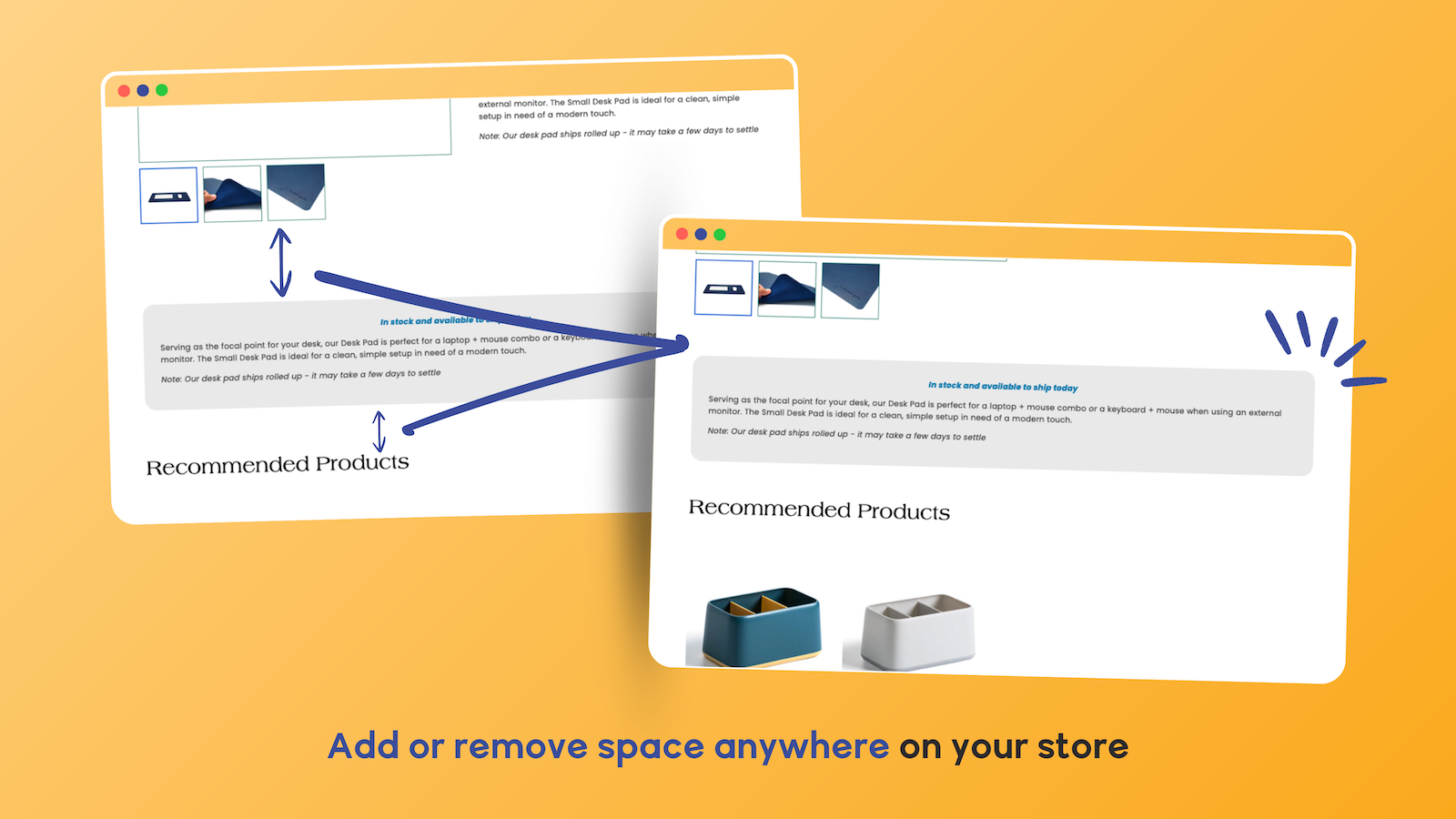
A web page just isn't perfect until the SPACING between each element of the page is just right. The problem is that you almost never have control of how much vertical space there is between each section and block comprising the page... until now, that is!
Introducing SPACER: Add or Remove Space
With SPACER, you can easily add blank space or remove space between any sections or blocks on any page of your site.
Want to increase or decrease the vertical spacing (i.e. number of pixels) between the product title and the star reviews? Or between the price and the 'Add to Cart' button? Or between the share icons and the product description? Just insert a SPACER block (or 2 or 3 or 10)! You can add a SPACER block between any two blocks to adjust the amount of vertical space between them.
Want to change the vertical spacing between two sections on your home page? Or collection page? Or product page? Or blog page? Just insert a SPACER section between the two sections. With SPACER, you can insert an unlimited number of SPACER sections and blocks throughout your store's page templates in Shopify's theme editor.
Separate Settings for Desktop and Mobile
On many Shopify themes, the vertical spacing between page components looks a little different on desktop computers than it does on mobile devices. No problem! SPACER allows you to specify a different amount of pixels to insert (or remove) for desktop and mobile devices.
Background Settings Included
You can apply a background color to each SPACER section or block to match the background color of the section/block above or below the spacer. Also, for full-page-width sections, you can optionally make the background color span the full width of the customer's screen (not just the page width).
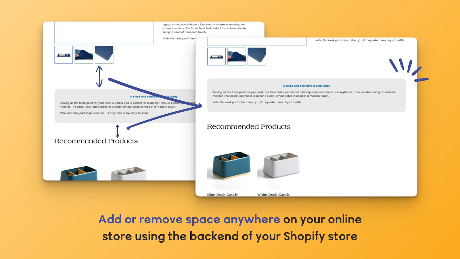
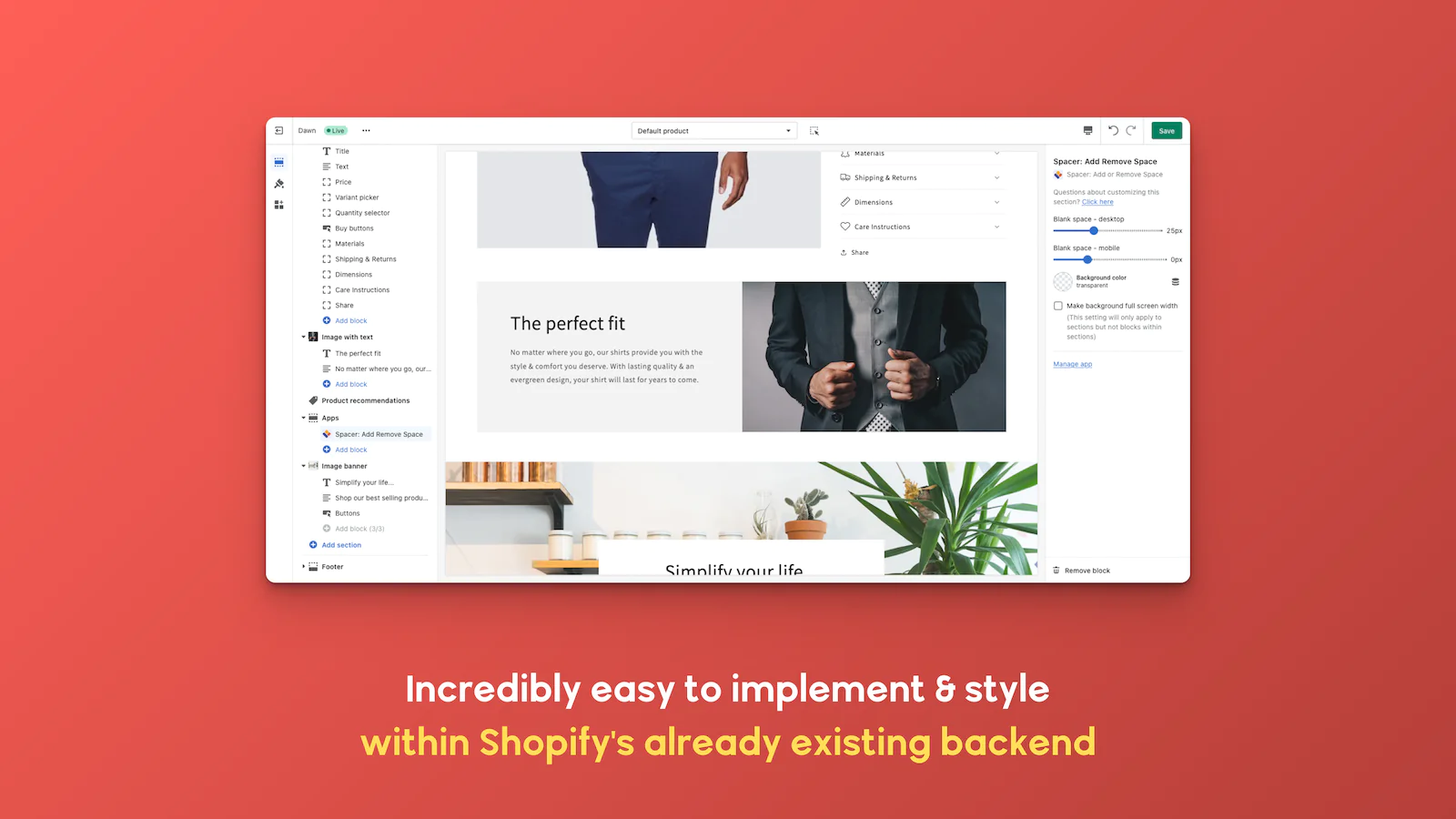
Seamless workflow: use directly in Shopify admin
Up-to-date tech: works with the latest themes
About the Author
Matej Kontros is an E-Commerce expert and app developer with over a decade of professional experience in IT.
Matej has worked for organisations of all types and sizes, including global players, startups, and agencies. He designed, developed, and maintained complex projects.
Matej's expertise includes e-commerce, software engineering, web development, systems administration, internet security, managing projects, and building teams.
Visit his website at [ Web Linkedin ] or contact him at [email protected].