Shopify App : Easy Responsive Videos & Maps
Make your website fully responsive. Responsive maps and videos
About Easy Responsive Videos & Maps
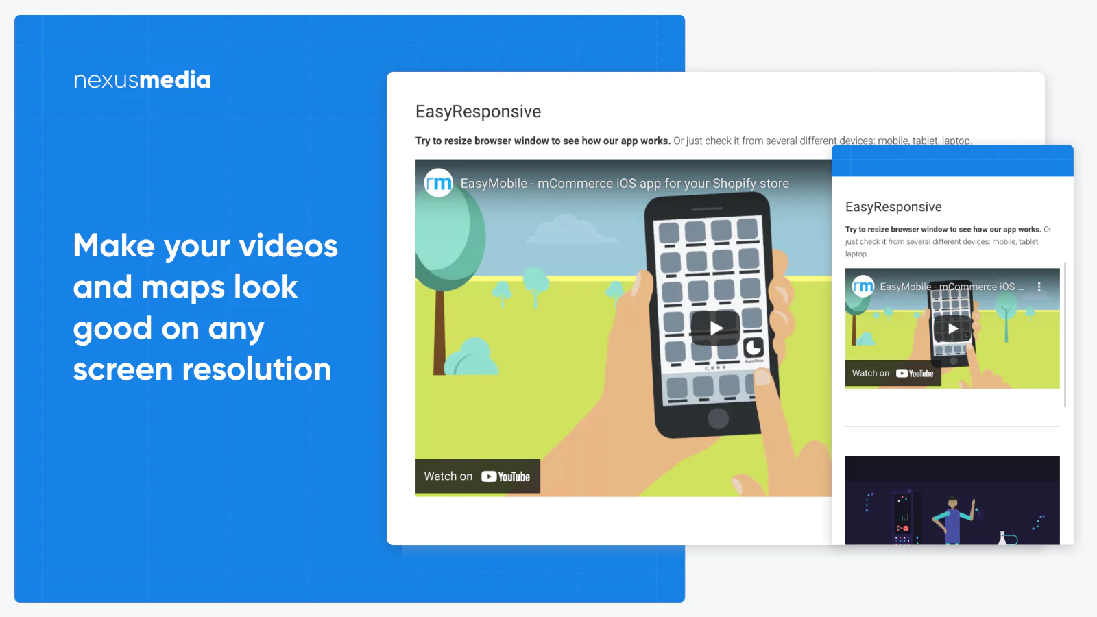
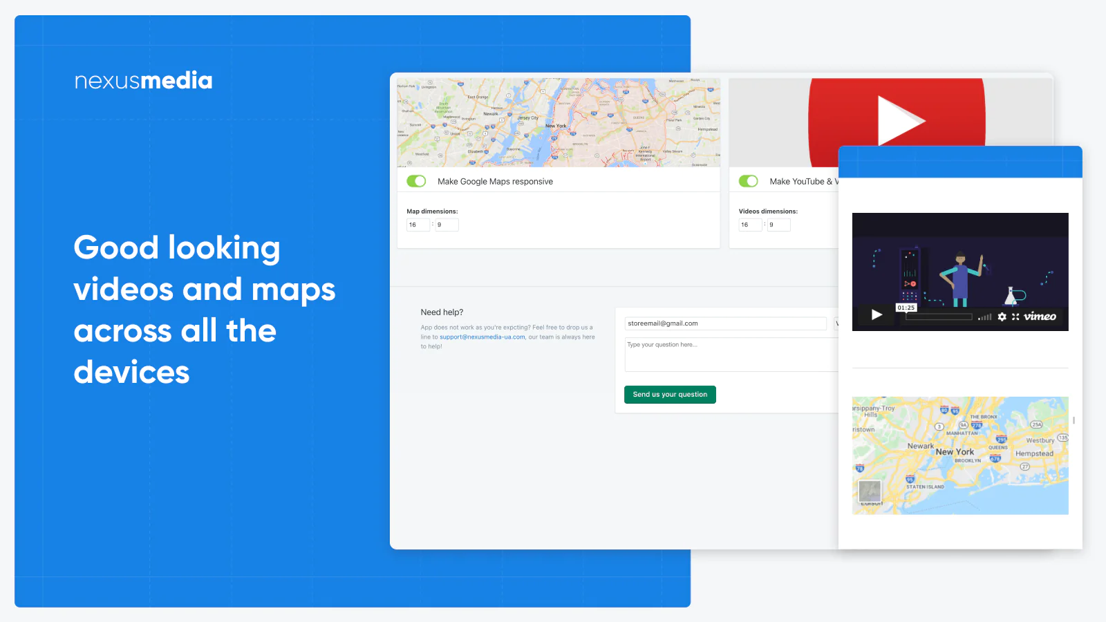
Fully responsive layout : Make sure your maps and videos are fully responsive and looking properly across all the devices.
Responsive videos : Flexible video aspect ratio. Configure embedded videos dimensions according to your needs.
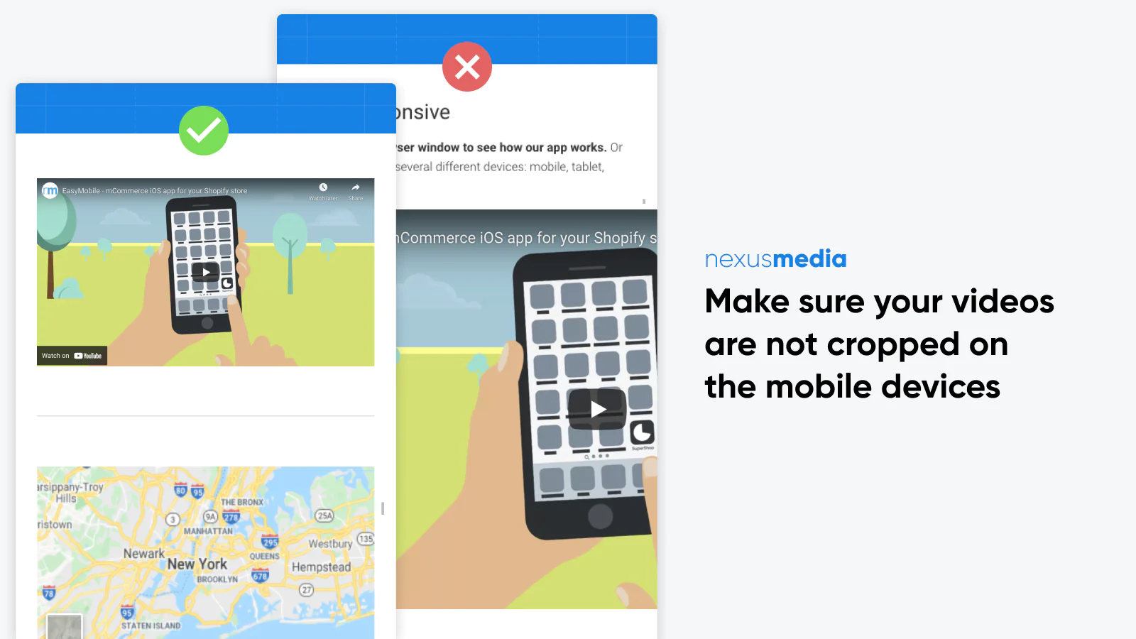
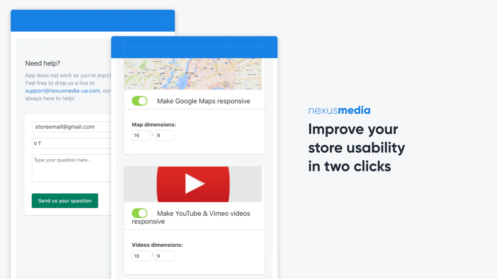
Improved usability : Improve your Store usability in two clicks, no more cut off videos or maps on mobile devices, make your store fully responsive.
What is Easy Responsive for?
Nowadays the most of Shopify themes are responsive so you're getting a good looking website on all the devices out of the box. But there're two things that are not responsive in the most themes: YouTube and Vimeo videos, and Google Maps.
Our small app solves that problem and makes your videos and maps responsive, so they're looking good across all the devices.
What pages are supported?
The app works on Pages, Articles, Products and any other page on your website.
Installation
Installation is extremely simple: just install the app on your store, and it will start working immediately making your maps and videos responsive! No need to add any codes to your templates manually.
Configuration
By default, the app uses 16:9 aspect ratio for both videos and maps while making them responsive, but if you prefer different aspect ratio (for example, if you'd like to have square maps), you may adjust dimensions in the app settings easily.
Supported videos and maps
At the moment our app supports YouTube and Vimeo videos, and Google Maps. If you're using another video hosting - please contact our support team and we'll do our best to add its support for you.


Seamless workflow: use directly in Shopify admin
About the Author
Matej Kontros is an E-Commerce expert and app developer with over a decade of professional experience in IT.
Matej has worked for organisations of all types and sizes, including global players, startups, and agencies. He designed, developed, and maintained complex projects.
Matej's expertise includes e-commerce, software engineering, web development, systems administration, internet security, managing projects, and building teams.
Visit his website at [ Web Linkedin ] or contact him at [email protected].